Stephanie MikkolaOwner / Brand Story
Fresh coastal flavor. Big personality. A new food-truck brand built to bring people together over hot, crispy, loaded quesadillas and an easygoing Surf City vibe.

Surf City Dillas is built around a simple idea: make craveable food, serve it with personality, and make the whole experience feel like part of a great day at the coast. The menu centers on hot, crispy quesadillas loaded with bold fillings, fresh toppings, and the kind of combinations people talk about after they leave.
The truck is designed to feel approachable enough for families, fun enough for visitors, and distinctive enough for locals to claim it as one of their spots.
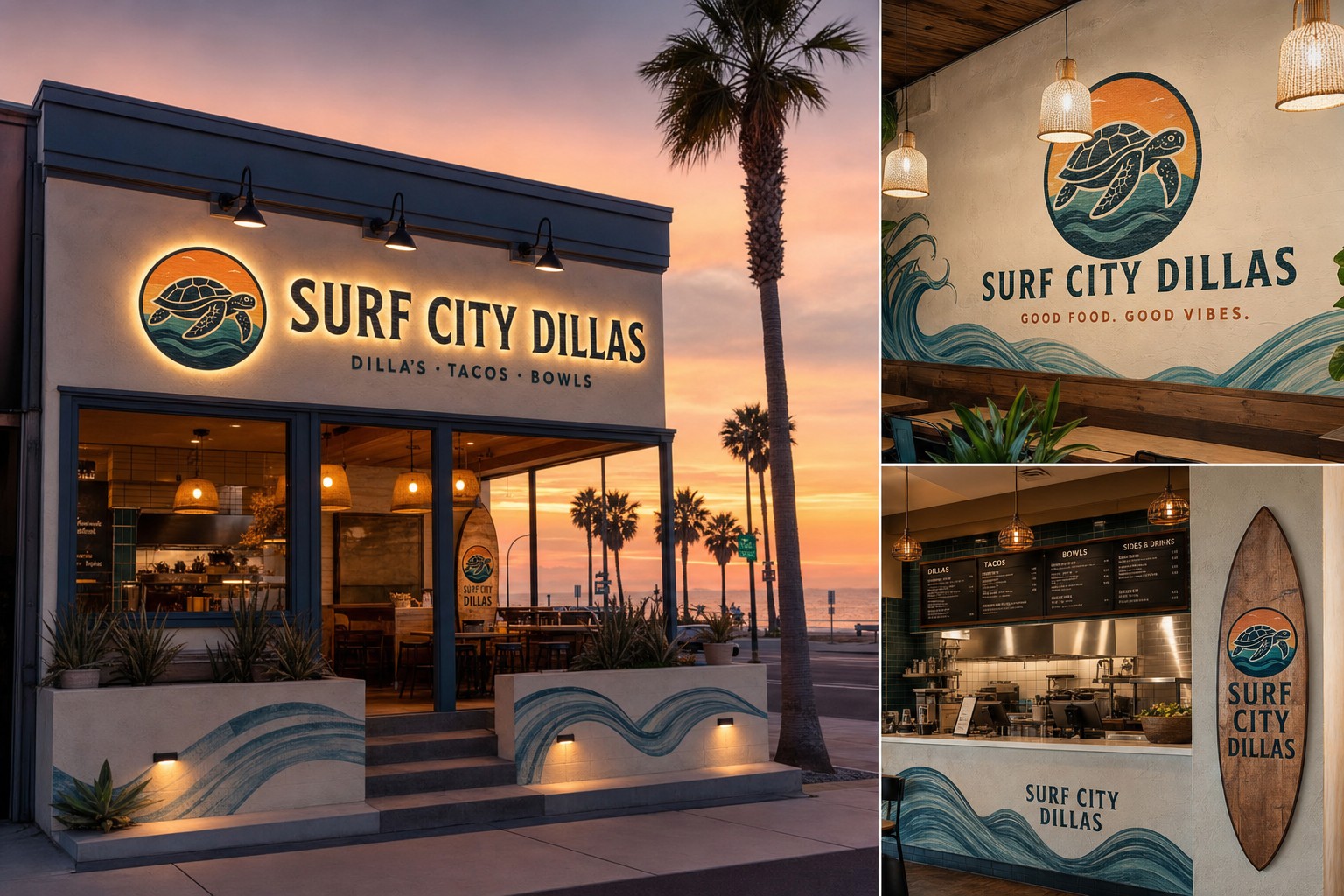
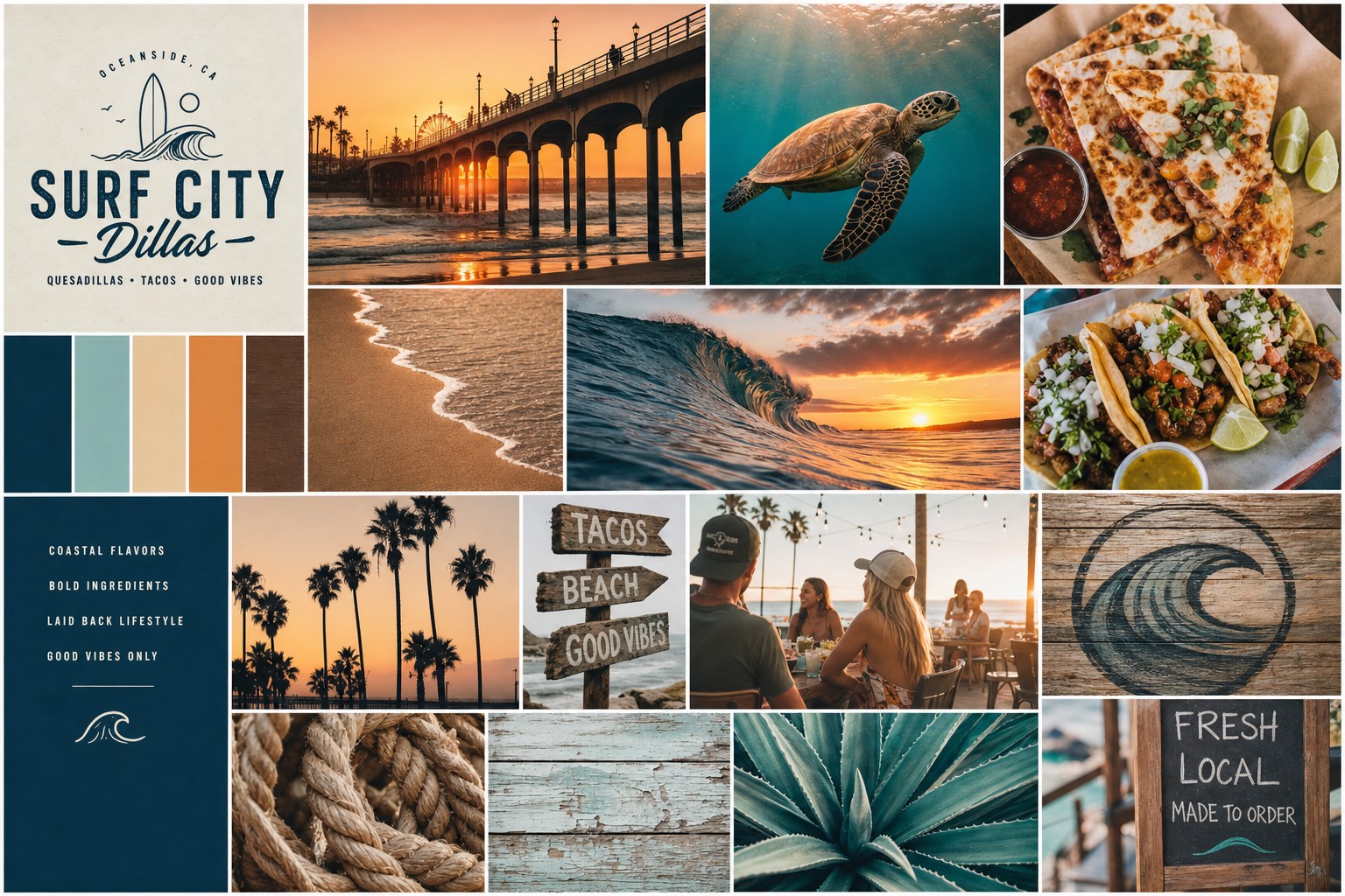
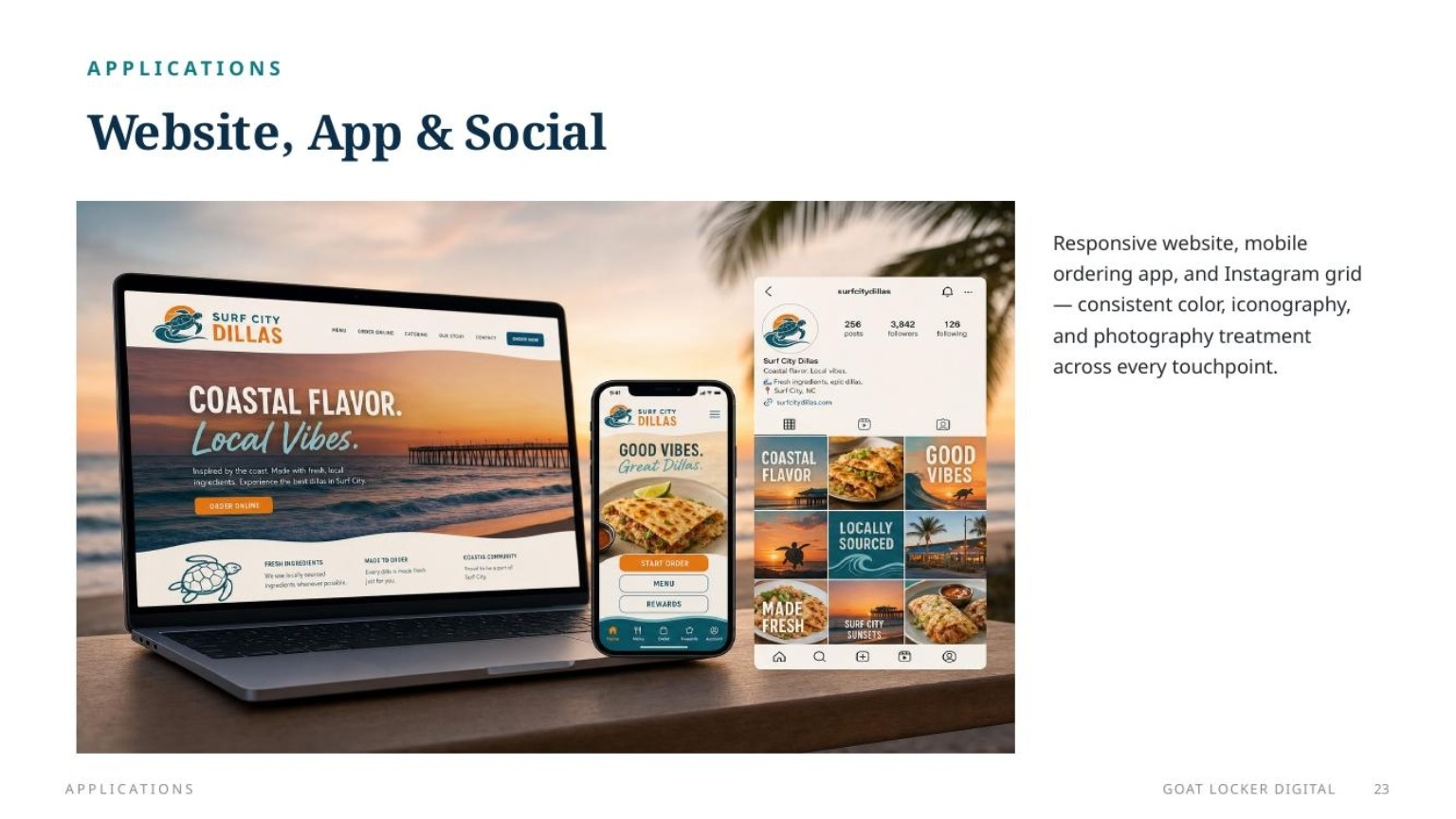
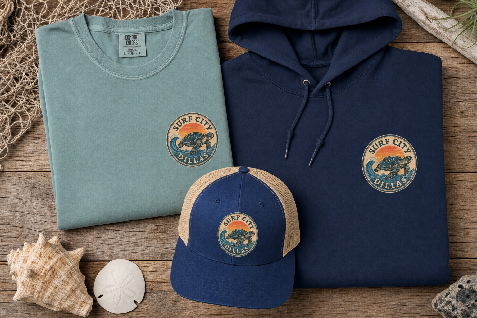
The identity is warm, recognizable, and made to work on a truck, menu board, shirt, hat, cup, social post, and future storefront.
Surf City Dillas is positioned to give Surf City something easy to understand and hard to forget: hand-held comfort food with coastal personality, quick-service convenience, and a brand that feels ready for beach days, lunch runs, late afternoons, events, and family nights.
Golden, crisp quesadillas, satisfying fillings, bold toppings, and sauces that give customers a reason to try another combination next time.
A casual, colorful experience that fits naturally into Surf City's relaxed food-truck and beach-town rhythm without feeling like another copy-paste surf concept.
Easy food for families, groups, visitors, locals, and events—whether customers grab one Dilla or turn the stop into a full table of food.
The brand is playful enough for funny menu names, crew favorites, social content, limited specials, and customer challenges.
The food-truck model keeps service convenient while the visual identity and menu experience make the visit feel bigger than a quick transaction.
The same brand can expand naturally into catering, festivals, merchandise, online ordering, a permanent location, and additional trucks.
The Surf City Dillas story is less about pretending the truck was discovered in some ancient coastal legend and more about what actually matters: family, good food, big opinions, good laughs, and somebody always insisting the Dilla needs one more topping.
Tim: “More toppings.”
Everybody: “It already has toppings.”
Tim: “Those are starter toppings.”
Stephanie: “We are trying to sell a Dilla, not test its load-bearing capacity.”
Ben: “Can we cost it before he adds another layer?”
Narrator: “Surf City Dillas: good food, good people, and apparently no upper limit on toppings.”
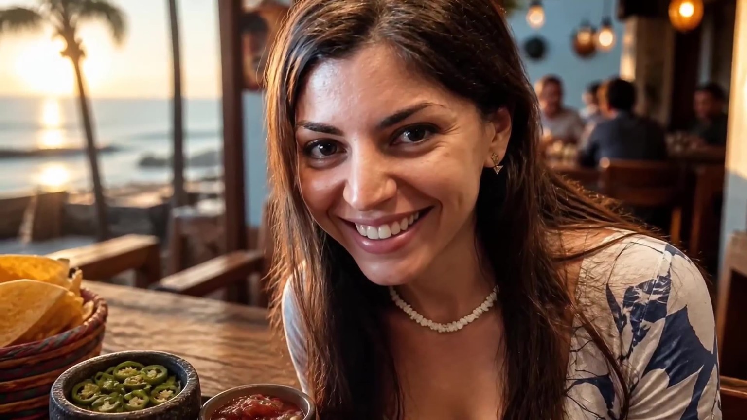
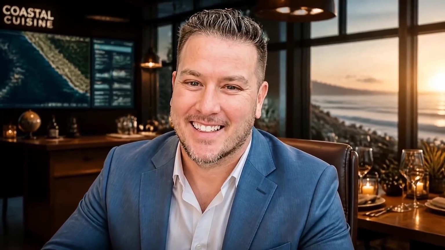
The brand is strongest when the people behind it are part of the story. These portraits can support launch posts, menu favorites, crew spotlights, and social videos.



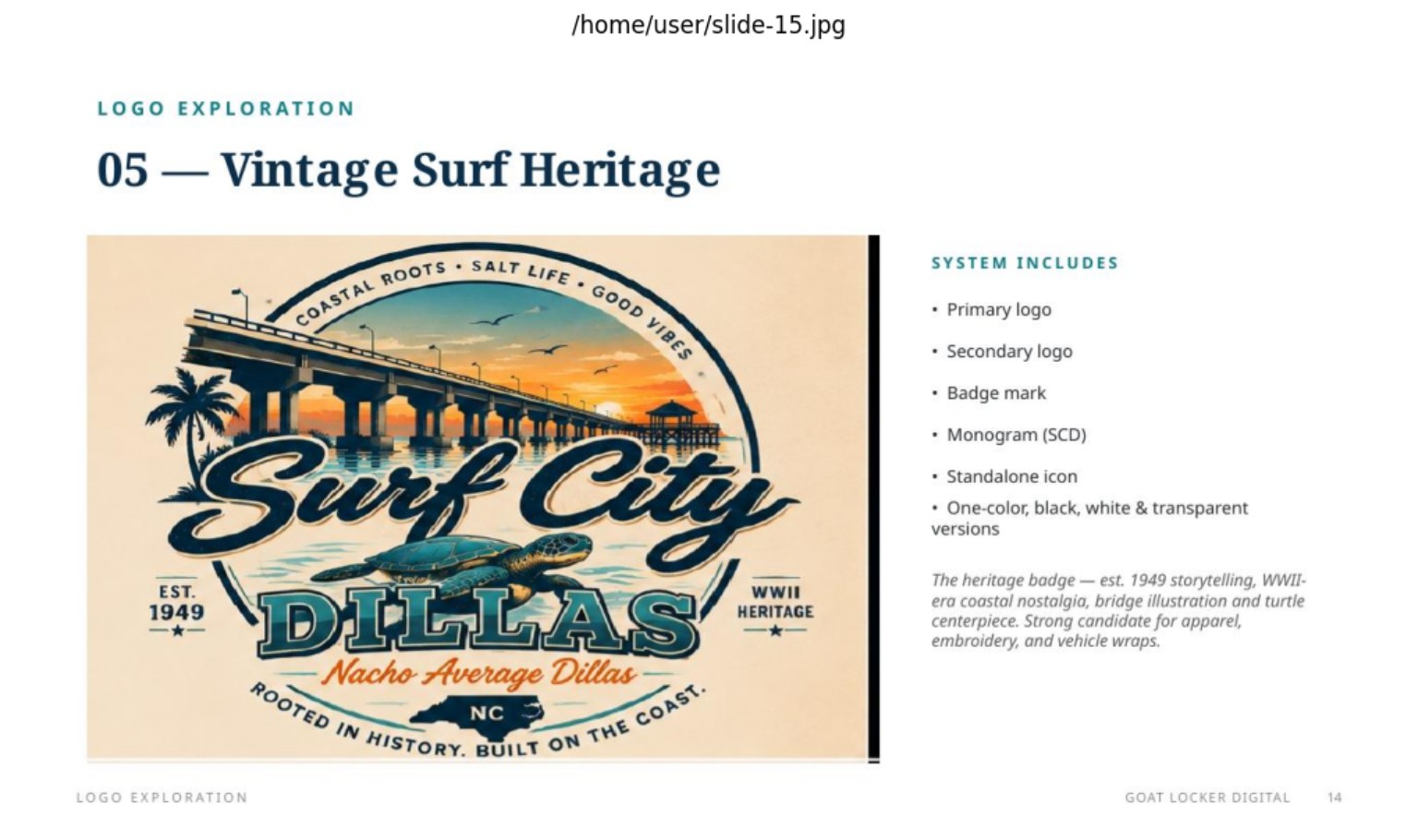
These are application examples showing how the identity can live across the customer experience. They are not alternate final logos—the purpose is to show flexibility and real-world potential.
The commercial is the emotional bridge between the concept and the final reveal—people, food, coast, energy, and the new business coming together in one launch moment.
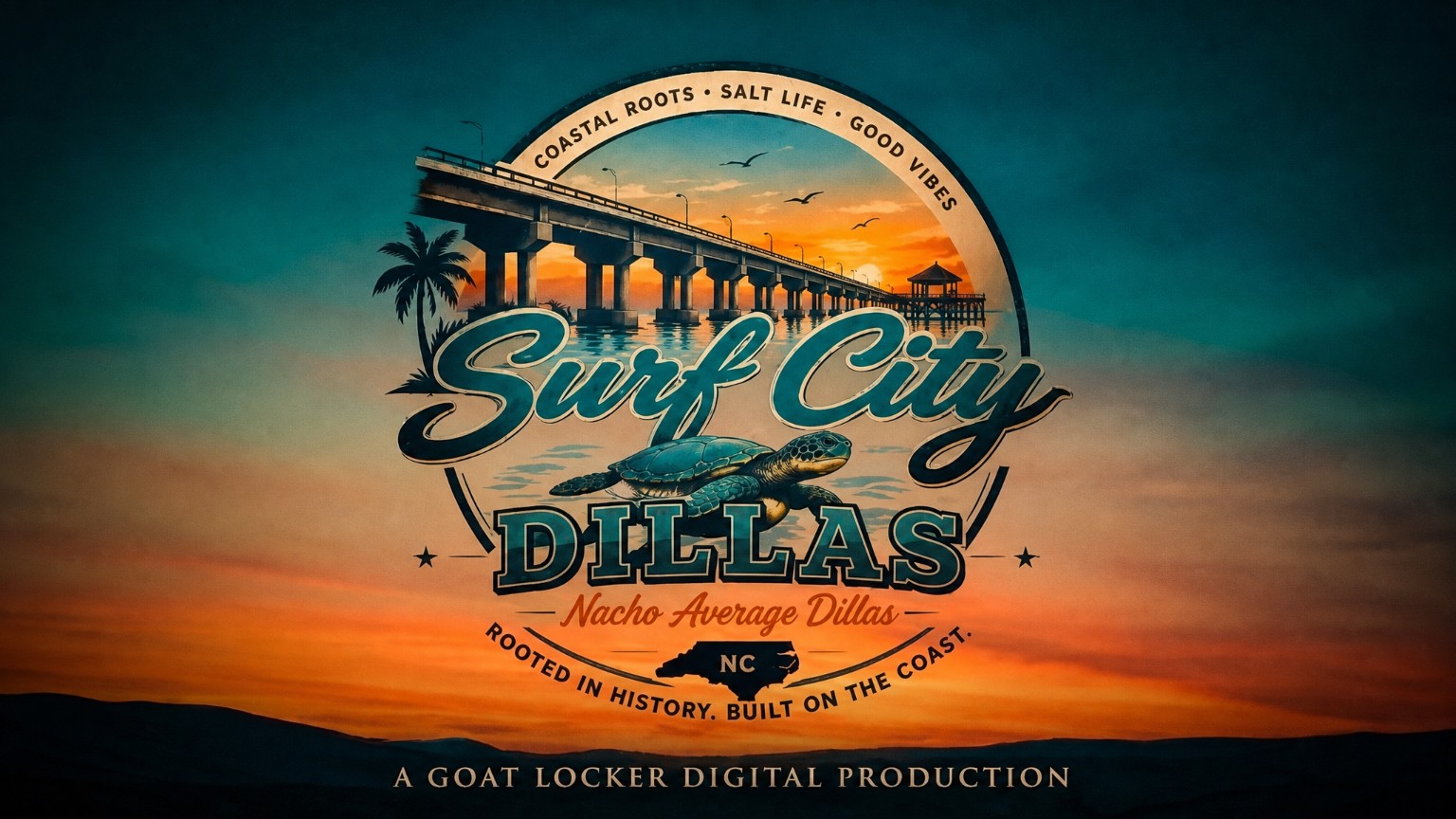
The exploration, mockups, commercial, and brand applications all lead here. This is the final identity—the mark meant to represent the new food truck as it launches into Surf City.